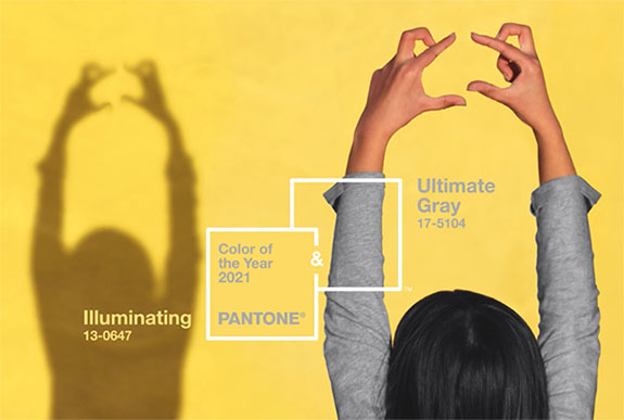
The Pantone Institute usually chooses a Color of the Year that reflects the current cultural climate. So, when faced with the somber reality of a global pandemic, but also the promise of better times ahead, the color experts at Pantone were conflicted. Should they pick the rock solid fortitude of "Ultimate Grey" or the sunny optimism of "Illuminating" yellow? In the end, they chose both.
From a gem lover's point of view, "Illuminating Yellow" apparel could be paired with yellow diamonds, yellow sapphires, citrine, yellow topaz, yellow garnet and yellow tourmaline, to name a few of the many gem varieties that are available in that Pantone color.
According to Pantone, Ultimate Gray (PANTONE 17-5104) and Illuminating (PANTONE 13-0647) are two independent colors that highlight how different elements come together to support one another. It is a story of color that encapsulates deeper feelings of thoughtfulness with the promise that everything is going to get brighter.
"This is a color combination that gives us resilience and hope," said Leatrice Eiseman, executive director of The Pantone Color Institute. "We need to feel encouraged and uplifted. This is essential to the human spirit."
Pantone described "Illuminating" as a bright and cheerful yellow sparkling with vivacity. It's a warming yellow shade imbued with solar power.
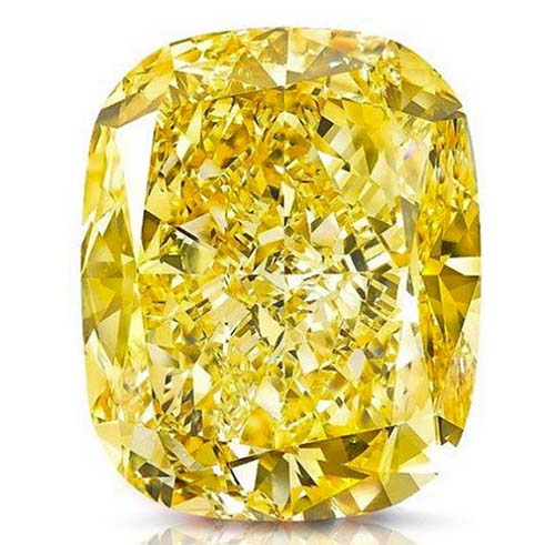
The shockingly beautiful, 132.55-carat “Golden Empress" diamond reflects the characteristics of Pantone’s "Illuminating" yellow. During its unveiling in 2015, billionaire British jeweler Laurence Graff described the stone as having an inextricably feminine and intensely warm molten-like glow that radiates from its core.
"Ultimate Gray" represents the colors of pebbles on the beach and natural elements whose weathered appearance highlights an ability to stand the test of time. One online publication unflatteringly said it looked like wet cement.
This is the second time in five years that The Pantone Institute has picked two Colors of the Year. In 2015, they chose "Rose Quartz" and "Serenity." Together, the mineral pink and tranquil blue combined to communicate a sense of wellness and peacefulness, with a dash of gender equality.
For more than 20 years, Pantone’s annual color selection has influenced product development and purchasing decisions in multiple industries, including fashion, home furnishings and industrial design, as well as product packaging and graphic design.
A year ago, Pantone’s Color of the Year was “Classic Blue,” a color described by Eiseman as “elegant in its simplicity.”
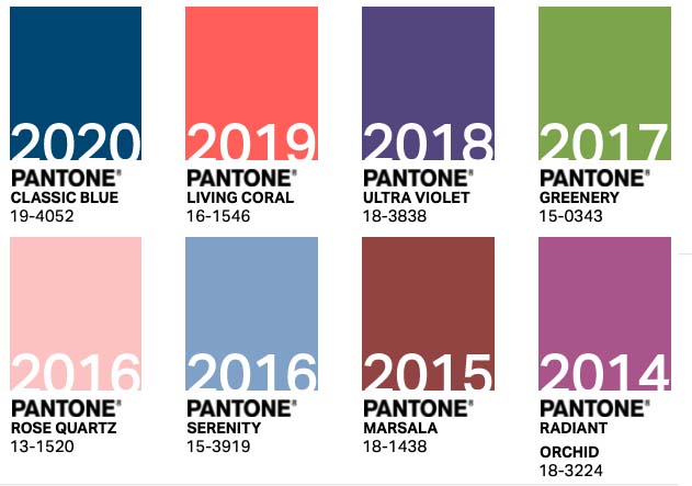
Here are the most recent Pantone Colors of the Year…
PANTONE 19-4052 Classic Blue (2020)
PANTONE 16-1546 Living Coral (2019)
PANTONE 18-3838 Ultra Violet (2018)
PANTONE 15-0343 Greenery (2017)
PANTONE 13-1520 Rose Quartz (2016)
PANTONE 15-3919 Serenity (2016)
PANTONE 18-1438 Marsala (2015)
PANTONE 18-3224 Radiant Orchid (2014)
Credits: Color swatches via Pantone.com. Gem photo courtesy of Graff.


