“Ultra Violet” is Pantone’s 2018 Color of the Year and we’re excited by the possibilities. While Pantone says the vibrant color communicates originality, ingenuity and visionary thinking, we see the Color Institute’s pick as a great reason to shine the spotlight on some of our favorite gemstones, including amethyst, tanzanite, iolite, spinel and violet sapphire.
We’re expecting jewelry designers to pepper their 2018 lines with ultraviolet accessories to complement the arrival of ultraviolet fashions.
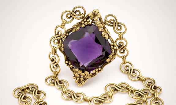
A fabulous representation of “Ultra Violet” is seen in the “Tiffany Amethyst Necklace,” a piece that June Rosner and Russell Bilgore donated to the Smithsonian in 2007. The 56-carat square cushion-cut amethyst is set in an 18-karat yellow gold necklace designed by Louis Comfort Tiffany, circa 1915.
Each year since 2000, the color experts at Pantone have picked a color that reflects the current cultural climate. Typically, Pantone’s selection influences the worlds of high fashion, beauty, housewares, home and industrial design and consumer packaging.
Pantone calls Ultra Violet a dramatically provocative and thoughtful shade of purple, suggesting the mysteries of the cosmos, the intrigue of what lies ahead and the discoveries beyond where we are now. Pantone says Ultra Violet is nuanced and full of emotion. It’s a color that symbolizes experimentation and non-conformity, spurring individuals to imagine their unique mark on the world and push boundaries through creative outlets.
Among the musical icons who used shades of ultraviolet to express their individuality were Prince, David Bowie and Jimi Hendrix, noted Pantone.
Ultra Violet also has a calmer, spiritual side. For example, purple-tone lighting has been used in meditation spaces because the color is said to have the ability to inspire connections. Ultraviolet is also said to offer a higher ground to those seeking refuge from today’s overstimulated world.
“The Pantone Color of the Year has come to mean so much more than ‘what’s trending’ in the world of design,” said Laurie Pressman, Vice President of the Pantone Color Institute. “It’s truly a reflection of what’s needed in our world today.”
The process of choosing the annual color takes about nine months, with Pantone’s trend watchers scanning the globe’s fashion runways and high-profile events for “proof points” until one color emerges as the clear winner.
A year ago, Pantone’s Color of the Year was “Greenery,” a fresh and zesty yellow-green shade that evokes the first days of spring.
In 2016, Pantone blended two shades — Rose Quartz and Serenity Blue — to create its 2016 Color of the Year. Together, the mineral pink and tranquil blue combined to communicate a sense of wellness and peacefulness, with a dash of gender equality.
Here are the most recent Pantone Colors of the Year…
PANTONE 15-0343 Greenery (2017)
PANTONE 13-1520 Rose Quartz (2016)
PANTONE 15-3919 Serenity (2016)
PANTONE 18-1438 Marsala (2015)
PANTONE 18-3224 Radiant Orchid (2014)
PANTONE 17-5641 Emerald (2013)
PANTONE 17-1463 Tangerine Tango (2012)
PANTONE 18-2120 Honeysuckle (2011)
PANTONE 15-5519 Turquoise (2010)
Credits: Color of the Year images courtesy of Pantone. Tiffany Amethyst Necklace image by Chip Clark/Smithsonian.


